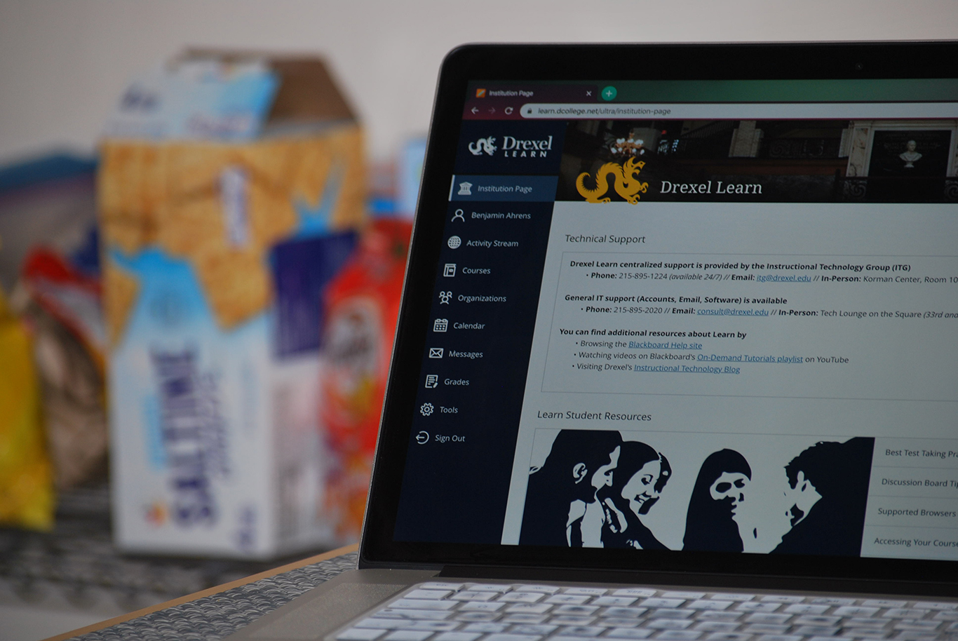
When I loaded up Drexel Learn after returning from winter break, I was both surprised and happy to see that it had a completely new appearance. Ever since arriving at Drexel, I’ve been looking at that old version of Drexel Learn for so long, and I honestly didn’t realize how much it needed a rework.
Admittedly, the old version of Drexel Learn wasn’t exactly the most intuitive system, but it did get the job done well enough, and for me it was pretty stable all the time. I don’t remember there being many problems with it, especially not on a daily basis. There were only a handful of times each year when the site was down due to maintenance issues or some kind of major system crash where it wasn’t accessible. So, in terms of how well it worked and how often it worked, I had no major complaints as it never effected me to the point where I couldn’t submit an assignment or access class material.
However, that is not to say that the old version of Drexel Learn didn’t have a number of faults. The interface was clunky at times, with notifications not showing up and not going away when they were supposed to, or certain files and attachments being buried underneath thousands of tabs. These were small user interface things that occasionally piled up to make navigating the site a nuisance.
The new Drexel Learn is, in all honesty, very pleasing from an aesthetic perspective. It’s much cleaner visually than it used to be. The menu items listed on the left of the screen are all easy to understand, the font is clear and the icons next to each section name make it very easy to distinguish one section from another.
These first two weeks of getting used to the new Drexel Learn weren’t all that bad, and I was expecting it to be a lot more difficult to transition than it actually was. The courses section is probably the best part of the new look of the website, and this makes sense because it’s the most important section since students will be making the most use of it.
It’s very easy to navigate the different courses. The drop-down menu at the top of the courses section neatly lists the multiple quarters that you’ve had at Drexel, making it quick and efficient to access all your courses. And I don’t remember if this was a feature in the old version of Drexel Learn, but in this one, you have the option to add certain courses to your favorites, making it easy to distinguish certain classes if you so choose to. You also have the additional option to filter between “all courses,” “courses I am taking,” “open courses” and “completed courses.” Again, I don’t remember if this was a feature in the old Drexel Learn, but if it was I never noticed it. Regardless, it’s not hard to find in the new version and make use of.
The grades section is also well put together. The old version was always a bit annoying in that all the grades for one class would be put into a long list on the right side. This sometimes made it tedious to scroll through the various classes if you have a class that has many different grades for different assignments. While this system still exists, I find it to be presented much better now as it’s own entire window. You can easily select the option to view all the grades for a specific class, but if you only want to see certain ones that are listed, you can keep the view minimal.
Arguably the best part of the new design is the “Activity Stream” section that’s listed just under your profile. The stream gives a very clear, concise and comprehensible timeline of what’s been going on. For each entry, it lists the class, what piece of content has been added to the class and the date and time. On top of that, you can click on any of the entries and you will be automatically taken to where the content is located within Drexel Learn. I can’t stress enough how well designed this is and how well it has been implemented into the new version of Drexel Learn. It makes life a lot easier and helps with keeping up to date with all the classes we have.
Overall, I’m a big fan of the Drexel Learn rework. The old system wasn’t all that bad, but I think everyone knew that the general user interface, layout and look of the website needed an update. When I first heard that this change was going to happen, I was slightly annoyed because after using the old version of Drexel Learn for so long, I didn’t feel like adjusting to a completely new version of it. Luckily, my fears didn’t come to fruition, and the new version is a success in my opinion. The people responsible for designing the update and implementing it deserve to be congratulated, because not only is it well designed, it’s also a better tool for all Drexel students.